Michaels App Reskin
Refreshing the Michaels app for a younger audience
Overview
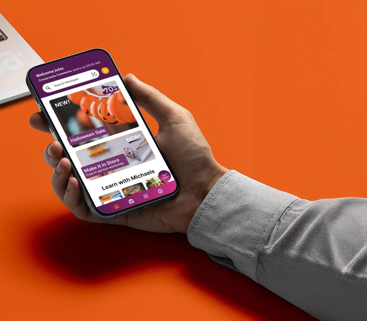
Meet the reskin
I reskinned the Michaels app for a younger audience. The current app is built around ads and deals, so I set out to calm it down, make it feel friendlier, and shape it around how a college student actually crafts: spontaneously, with friends, and on a budget.
Context
Wanting deals ≠ ad overload
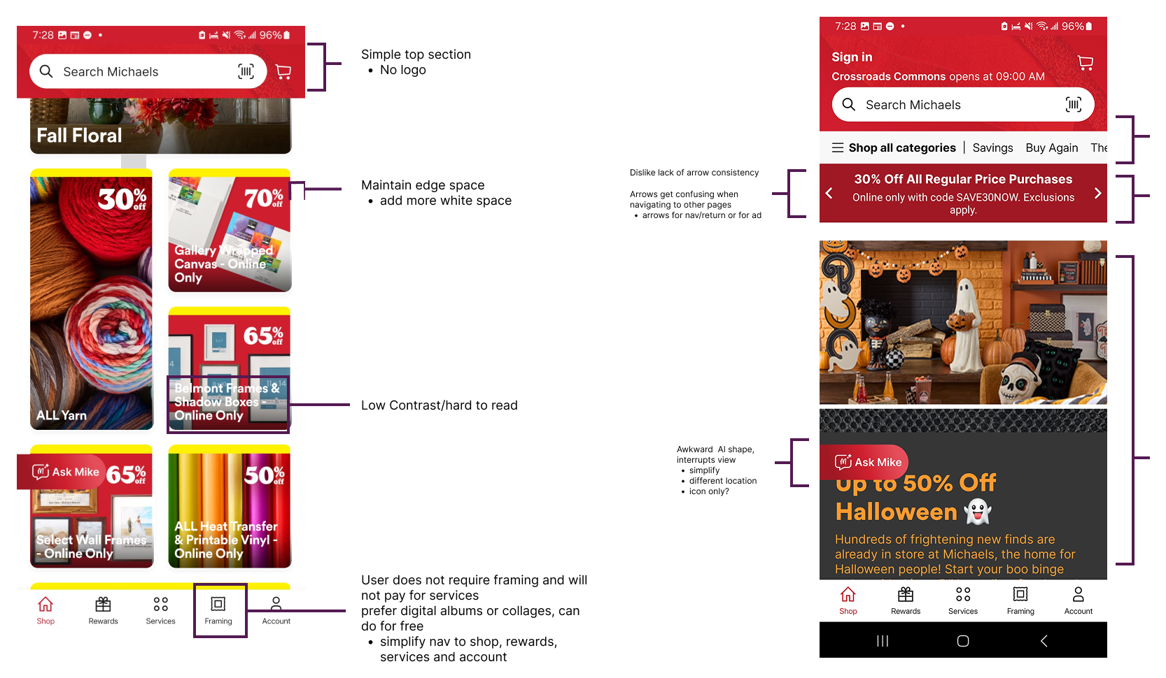
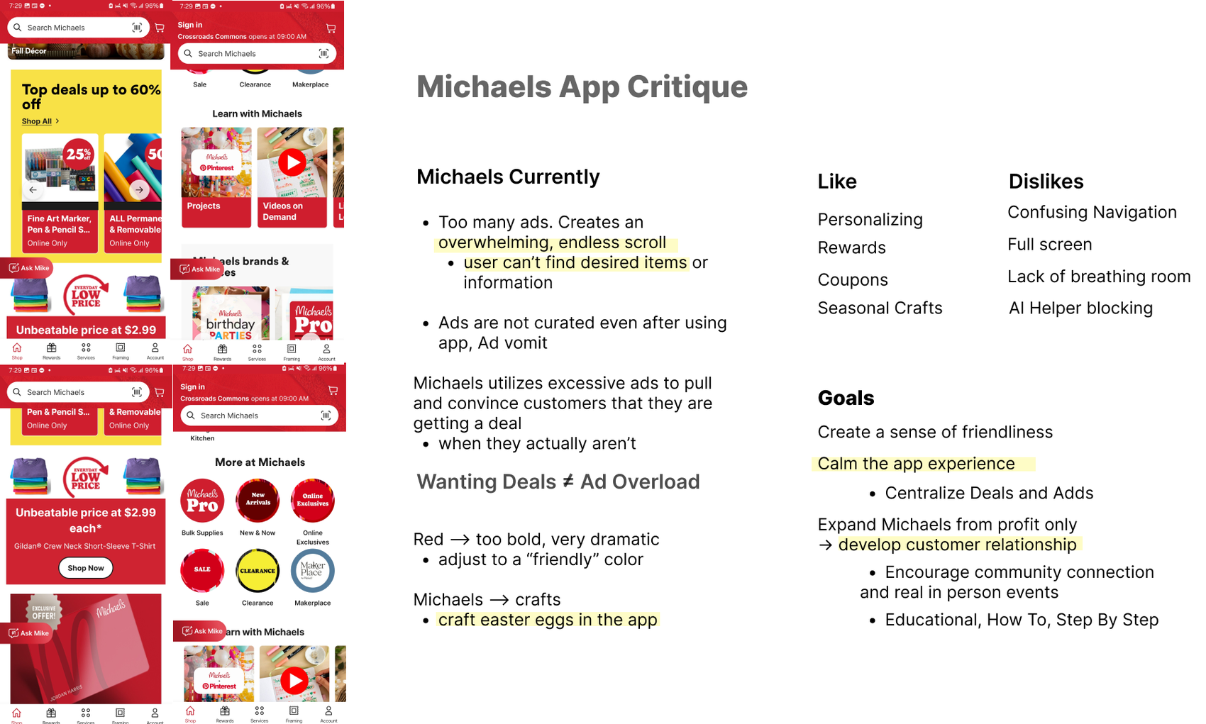
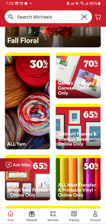
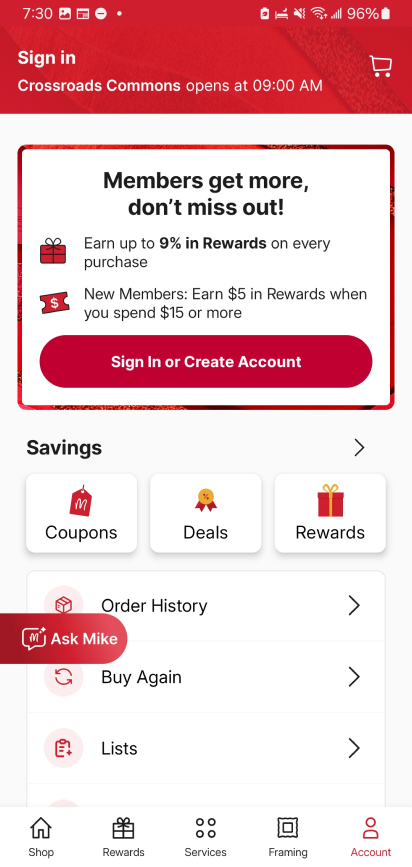
Michaels uses excessive ads to convince customers they are getting a deal when they actually aren’t. The result is an overwhelming, endless scroll where users can’t find the items or information they came for, and the ads aren’t curated even after using the app. I critiqued the home and account screens and marked what to fix: low contrast text over images, little breathing room at the edges, inconsistent arrows, a red that feels too bold and dramatic, and an AI helper that blocks the view.
Solution
Final product
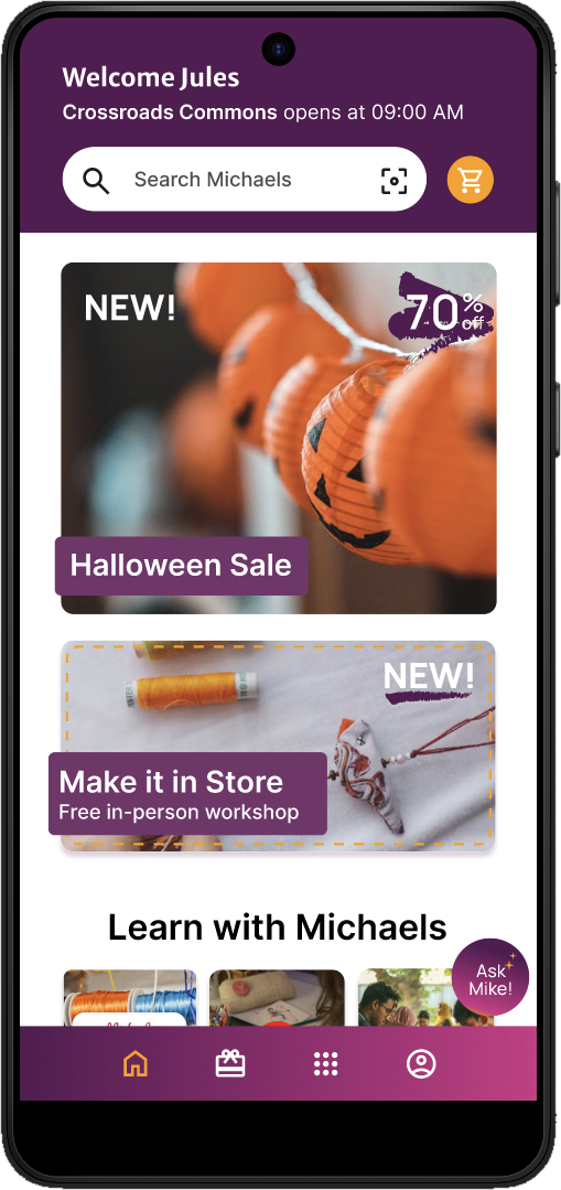
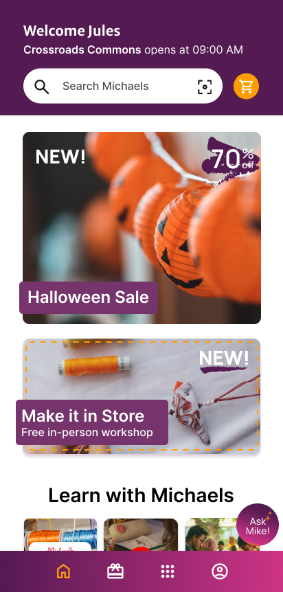
The reskin calms the experience down. A friendly purple palette replaces the bold red, the top section stays simple, and the home screen greets the user by name. Deals and ads are centralized into a few curated cards instead of an endless scroll.
Solution
Centralized deals and ads: a clear Halloween Sale card, a Make it in Store workshop card and a single Deals section replace the stacked promotions, with larger labels and stronger contrast so text stays readable.
Solution
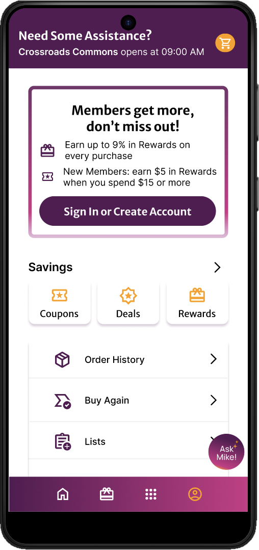
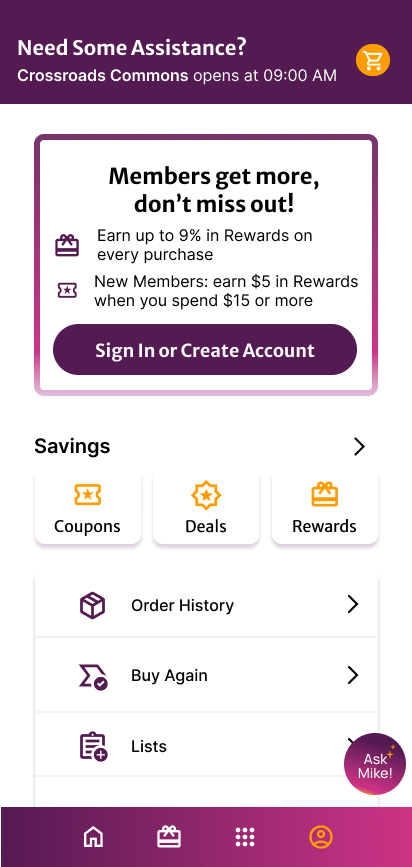
Simpler navigation: framing is gone, so the bar focuses on shop, rewards, services and account. Ask Mike! became a compact round button that no longer blocks the view.
Prototype
Scrolling, calmly
In the prototype the header shrinks to a slim search bar as you scroll, deals sit together in one place, and Learn with Michaels groups projects, tutorials and events so crafting feels social, not just a sale.
Process
From critique to persona
I started by listing what I like about the current app (personalizing, rewards, coupons and seasonal crafts) and what I dislike: confusing navigation, a full screen takeover, no breathing room and an AI helper that blocks the screen. From there I set my goals: create a sense of friendliness, calm the app experience by centralizing deals and ads, and expand Michaels from profit only to a relationship with customers through community connection, in person events, and educational, step by step how tos.
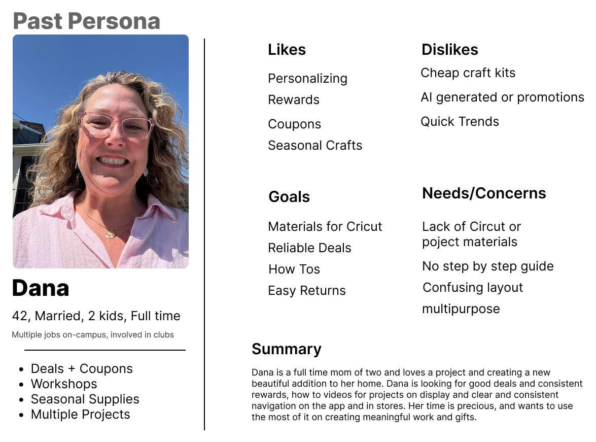
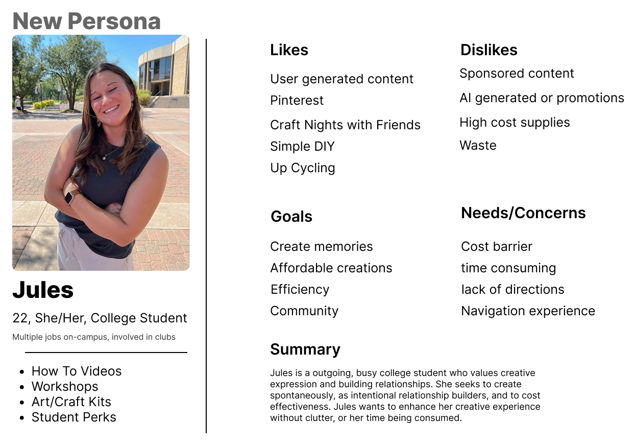
The original persona, Dana, is a 42 year old mom who works full time and wants reliable deals, how to videos and clear navigation. I shifted the focus to Jules, a busy 22 year old college student who values creative expression, community and simple, low cost DIY. She wants to enhance her creative experience without clutter or having her time consumed, which pointed to a calmer, friendlier app that makes crafting feel social and affordable.
Designing a friendlier Michaels
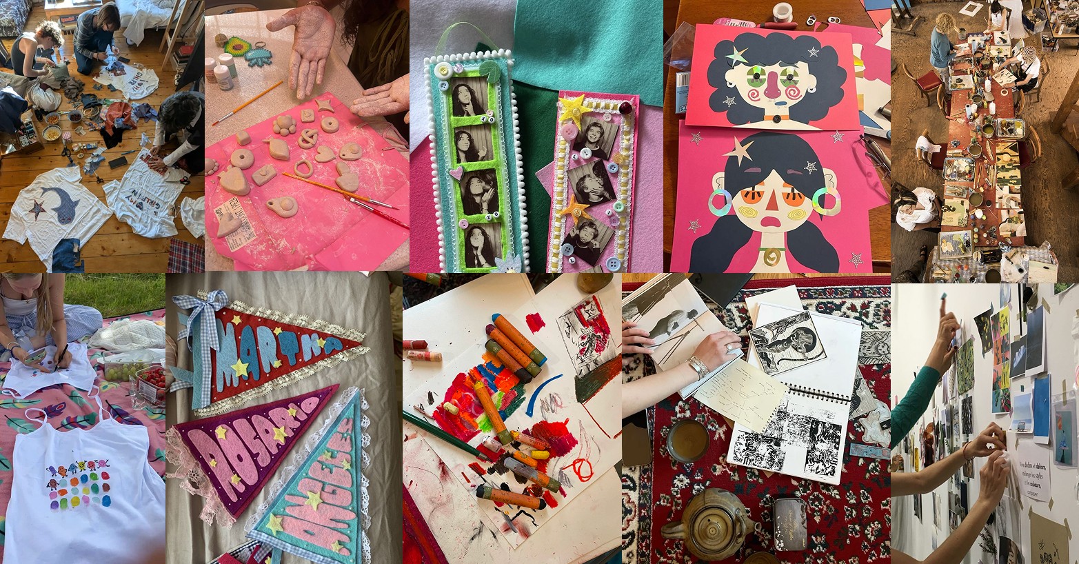
Michaels is about crafts, so I wanted the app to feel handmade and welcoming. I built a moodboard of craft nights: felt bookmarks, clay charms, collage, painted pennants and friends making things together.
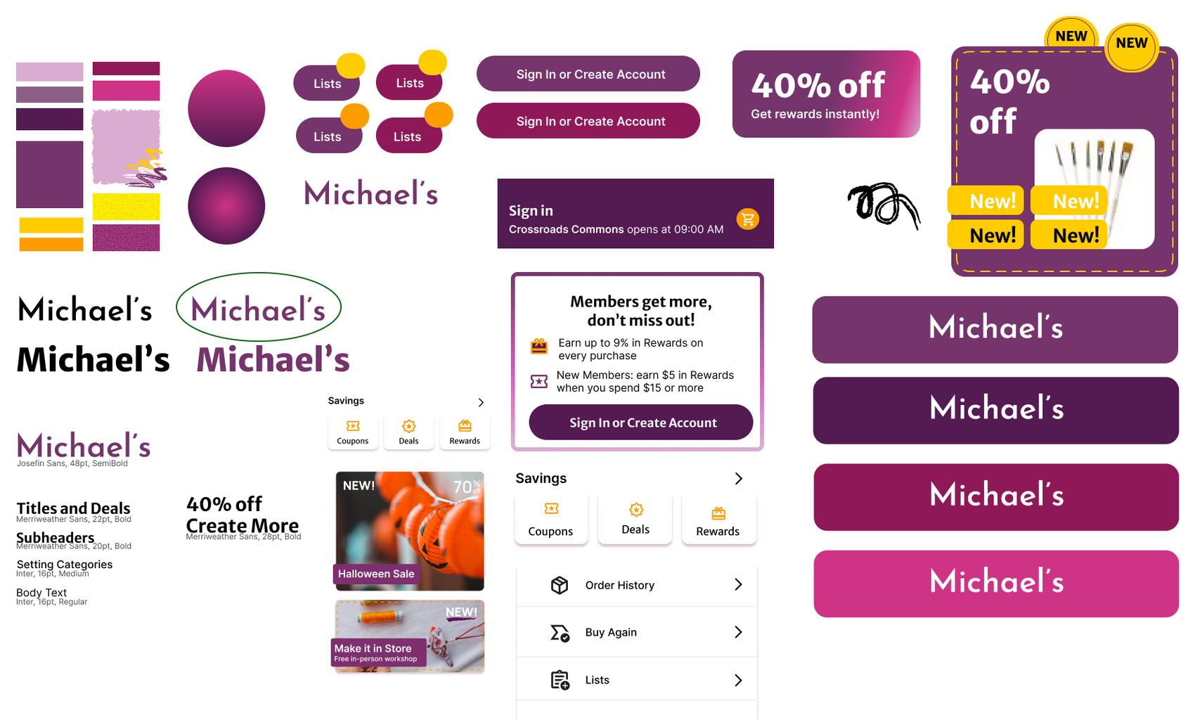
Red felt too bold and dramatic, so I moved to a plum and magenta palette with yellow and orange accents for warmth. The wordmark is set in Josefin Sans, titles and deals in Merriweather Sans, and categories and body text in Inter. Brush stroke textures, stickers like NEW and Going Fast, and a dashed border on the workshop card add a handmade feel.
Outcome
Before and after
The reskin turns an ad heavy, high contrast red app into a calmer purple one that puts search, curated deals and learning first, and gives every screen its breathing room back.
Solution
- a calmer, curated home screen
- better contrast and more white space
Solution
- simpler navigation and a compact Ask Mike!
- projects, tutorials and events that support community crafting