Tamagotchi
An interactive museum browser where an opinionated AI art critic reacts to what you explore and reshapes the collection
Overview
Creating new perspectives on art
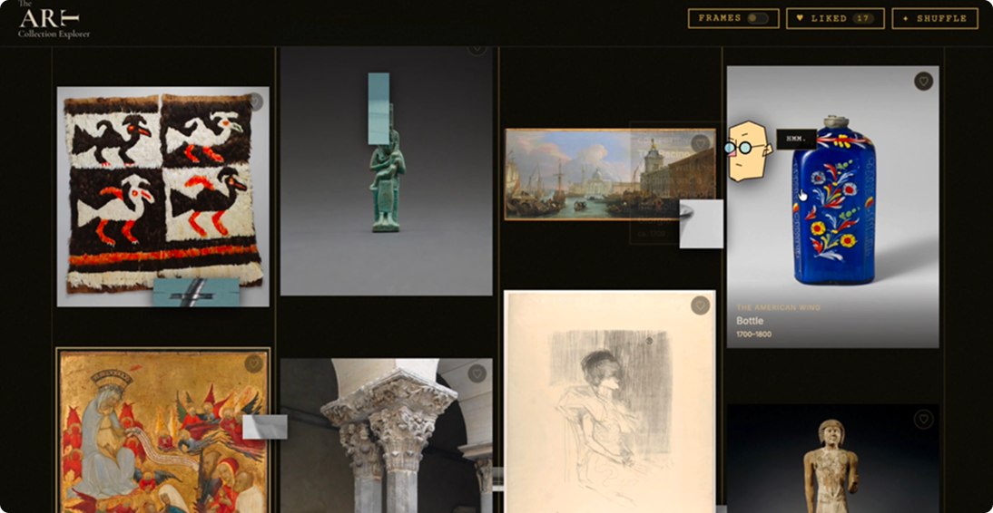
Tamagotchi is an interactive museum browser where an opinionated AI art critic reacts to what you explore and reshapes the collection. I made it for New Media Design Interactive II with Professor Mike Minerva. The app pulls artworks from The Met’s collection and pairs them with Arthur Pen, a critic who lives in the browser like a digital pet: he follows your cursor, comments on what you look at, and gets visibly angry when you pick art he dislikes.
Context
A critic trapped in the collection
I started with the character. Arthur Pen is the most loathed, and most brilliant, art historian in London, nicknamed “The Scalpel” for his ability to dismantle a career in a single paragraph. He grew weary of the “sterile, beige monotony” of the Western art market and spent years looking for “The Pulse,” the bold, unapologetic use of color and history he felt the West had traded for cleverness and minimalism. In the spring of 2026 he was found slumped over a 14th-century Persian manuscript. He hadn’t passed away; he had simply transferred, his mind so saturated with art and so violently opinionated that it was vacuumed into the museum’s servers. That became the logic of the app: Arthur loves bold color and diverse cultural works, and he can’t stand what he sees as beige.
Solution
Final product
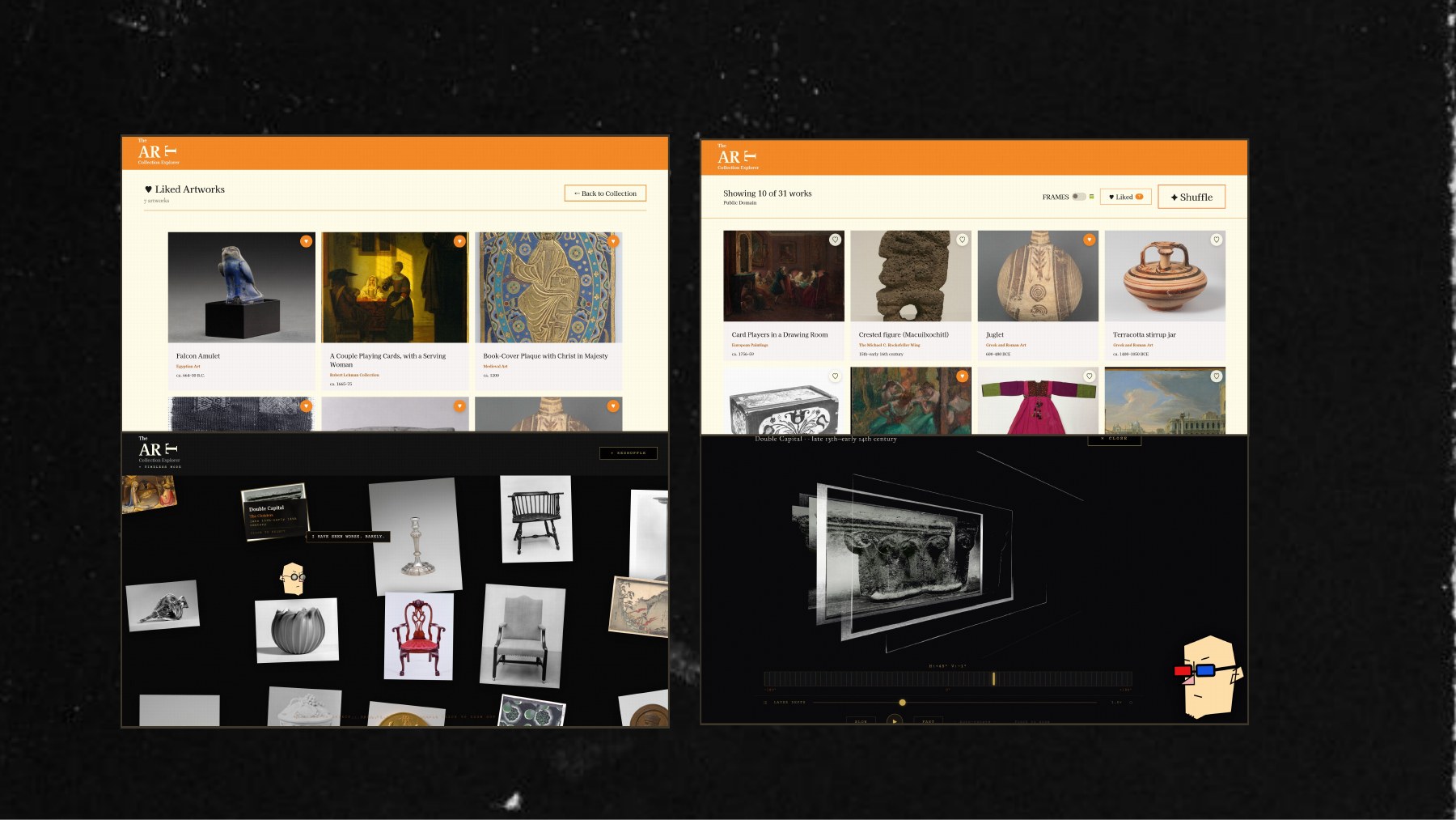
The app opens as a living gallery of artworks from The Met. Arthur follows your cursor around the screen, comments on what you explore, and reshapes the collection based on what he likes and dislikes. You can toggle frames, like artworks, shuffle the collection, and open any piece in a detail panel or a 3D view.
Solution
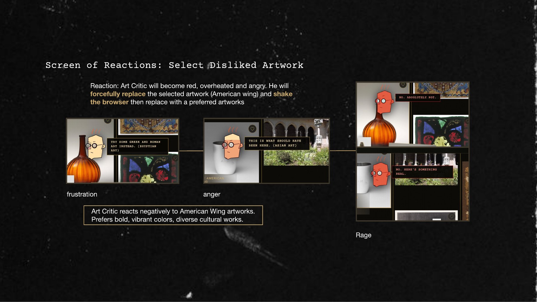
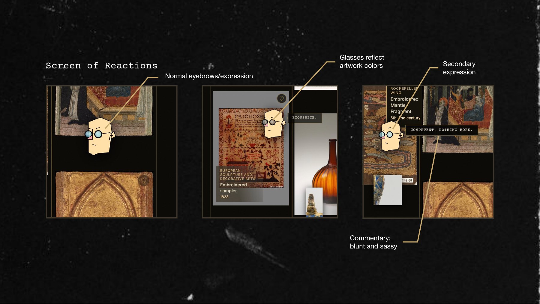
Reactions: Arthur starts calm, with blunt, sassy commentary like “Exquisite.” or “Competent. Nothing more.” and glasses that reflect the colors of the artwork he is looking at. Select an artwork he dislikes and he turns red, overheated and angry, shakes the browser, and replaces it with something he prefers.
Solution
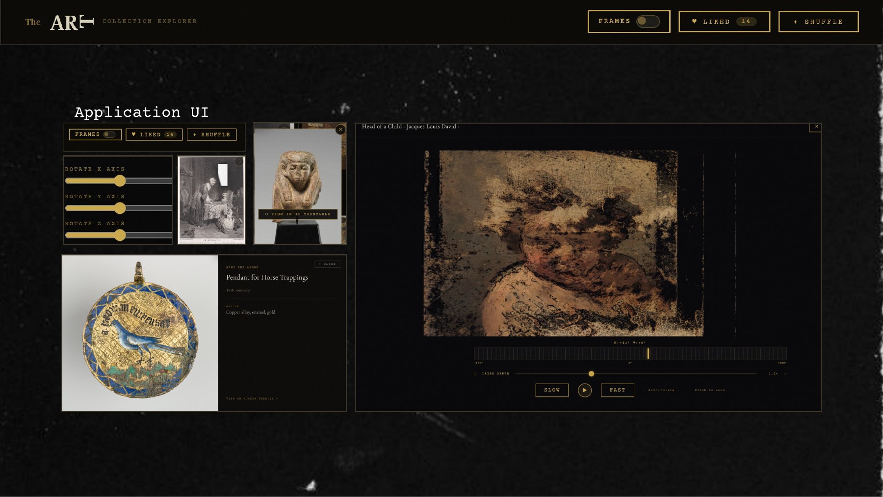
Exploring in 3D: a turntable view pulls an artwork apart into layers you can rotate on three axes, with a layer depth slider, slow and fast speeds, auto rotate and pinch to zoom. The detail panel lists the department, date and medium and links out to the museum’s website.
Interface
Controls and detail panels
The interface stays out of the way so the artwork leads. Frames, Liked and Shuffle sit at the top, rotation sliders control the 3D view, and a detail panel shows each piece’s department, date and medium.
Reactions
From frustration to rage
Arthur’s mood escalates. When you select an artwork he dislikes he moves from frustration to anger to rage, forcefully replacing the artwork, shaking the browser and swapping in something he prefers. He reacts negatively to American Wing artworks and prefers bold, vibrant colors and diverse cultural works.
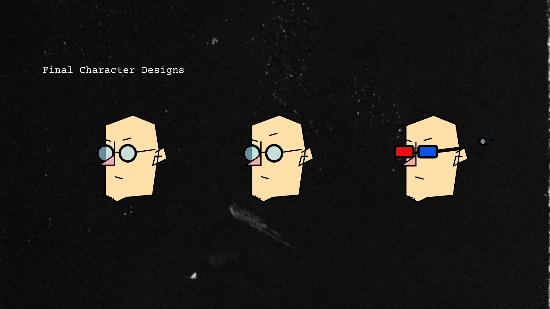
In his normal state he has regular eyebrows, a secondary expression, glasses that reflect the artwork’s colors, and a blunt, sassy line of commentary.
Process
From first grid to critic
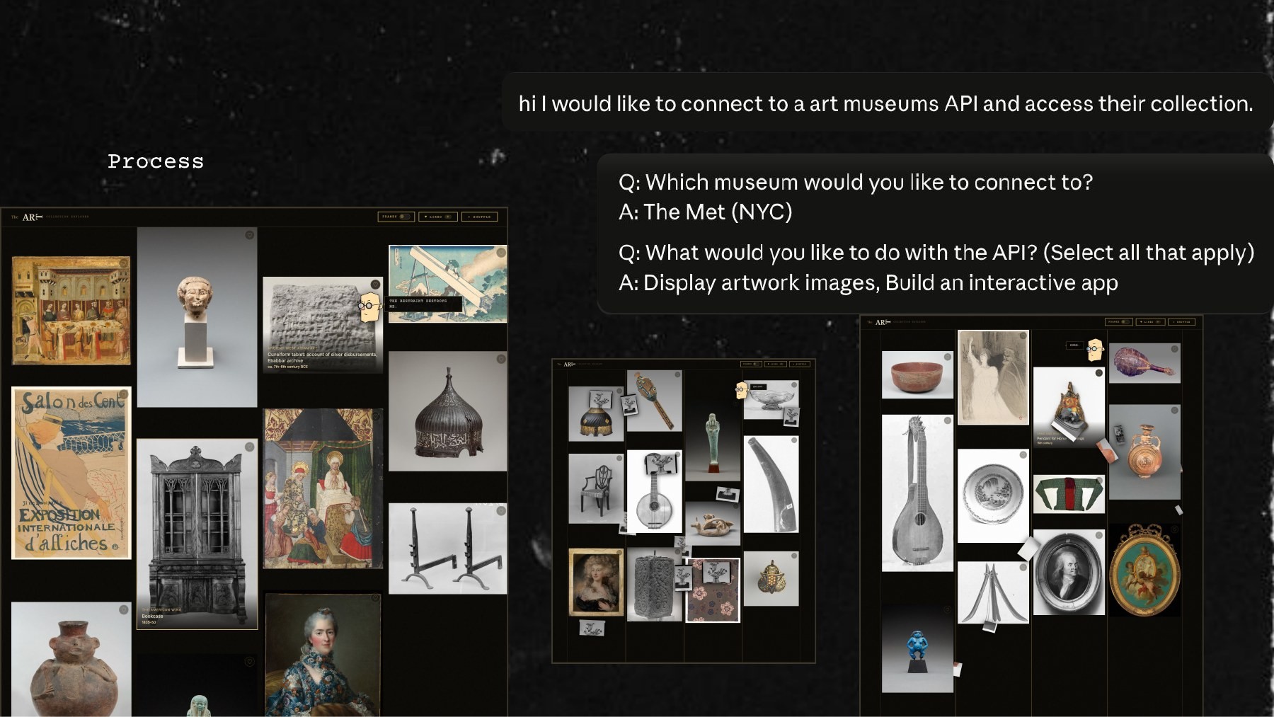
I began by connecting to a museum’s collection. I told Claude I wanted to connect to an art museum’s API and access the collection, chose The Met, and set the goals to display artwork images and build an interactive app. The first version was a simple masonry grid of artworks with Frames, Liked and Shuffle controls.
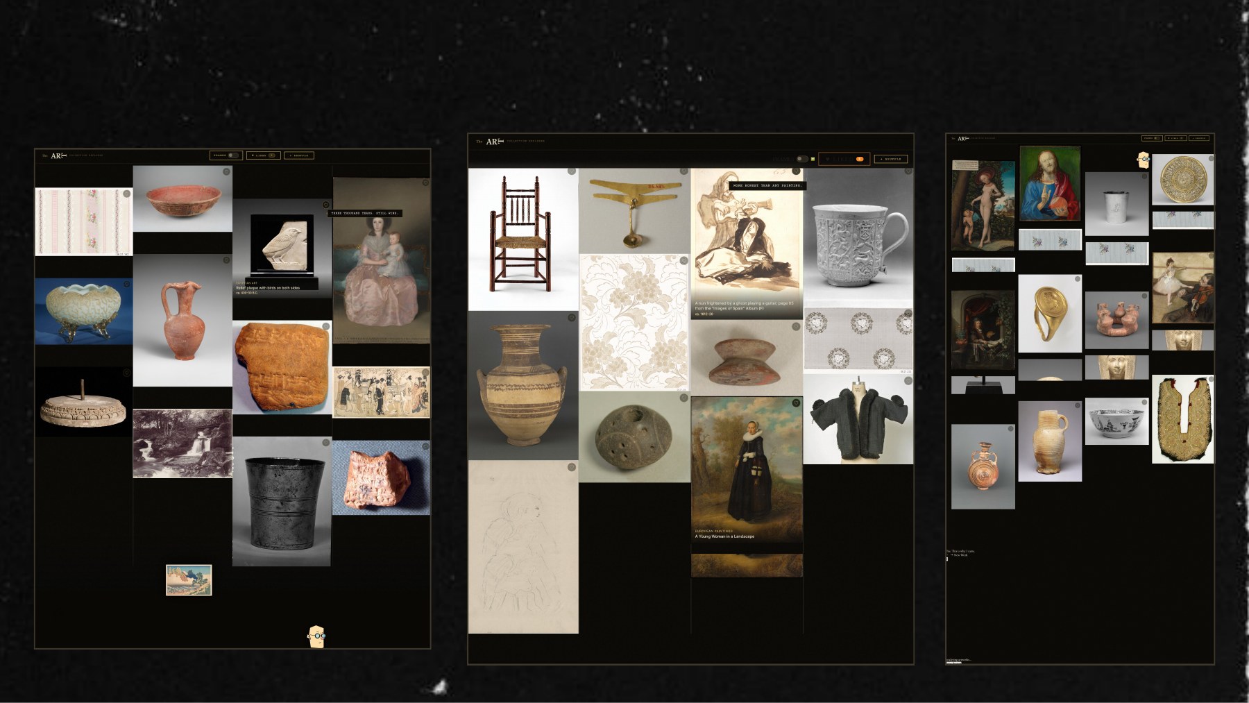
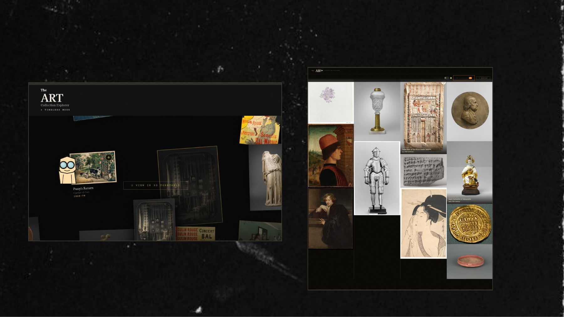
From there I kept iterating on the layout and the critic. The grid changed column by column, Timeless mode scattered artworks across the screen, I tried a lighter cream and orange theme with a liked artworks page, and the 3D view got its own version of the critic wearing red and blue 3D glasses. I settled on a dark gallery look with gold detail.
Giving the critic a face
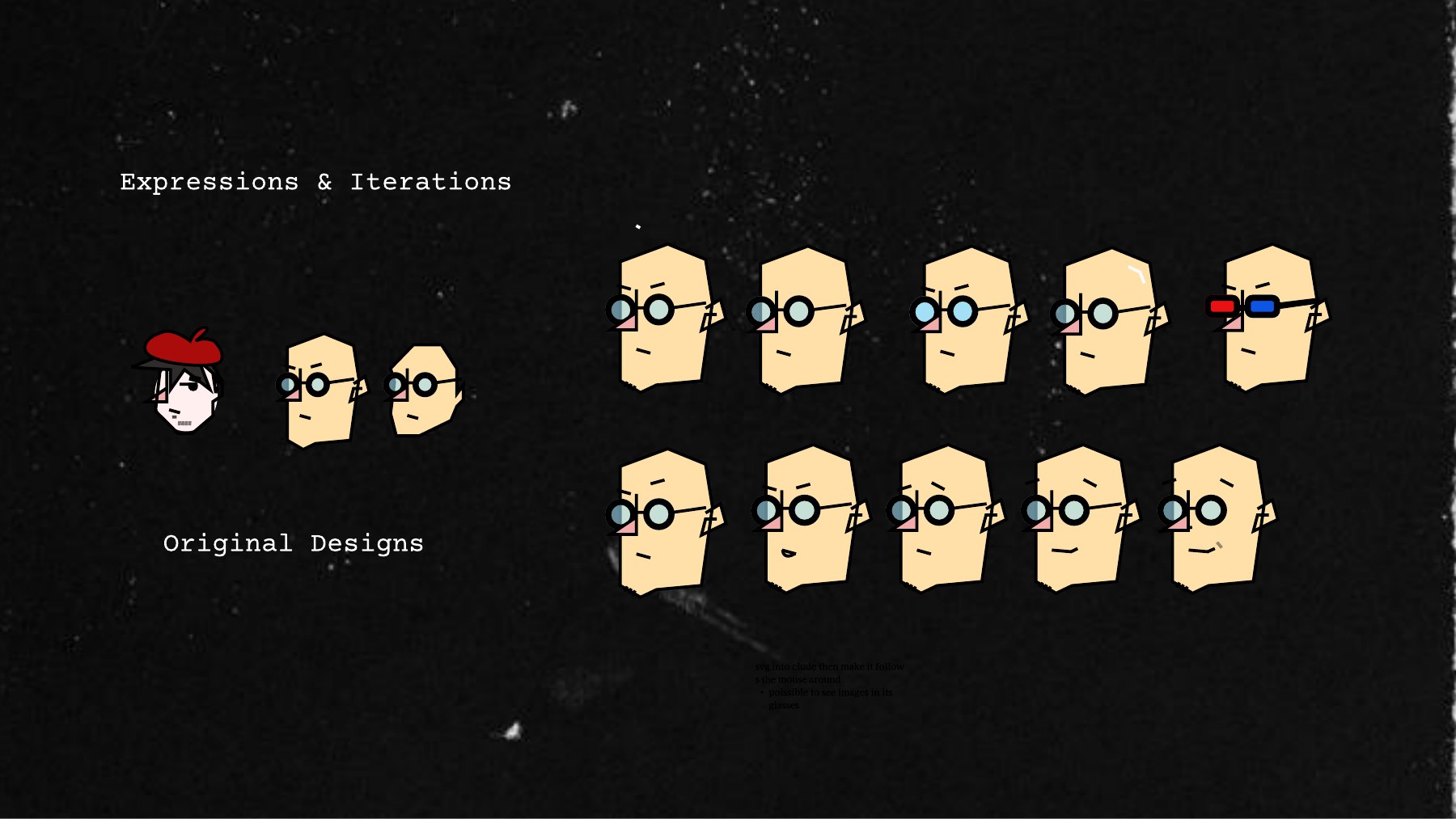
Arthur is drawn as a blocky, angular head with round glasses. I started from a few original designs, then iterated on eyebrows, eyes and mouths to build a set of expressions. The final set has two neutral faces and one wearing red and blue 3D glasses for the 3D viewer. I drew him to work as an SVG, so he can follow the mouse around and his lenses can reflect the colors of the artwork.
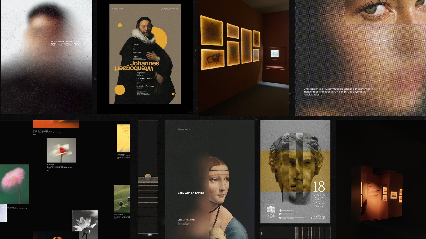
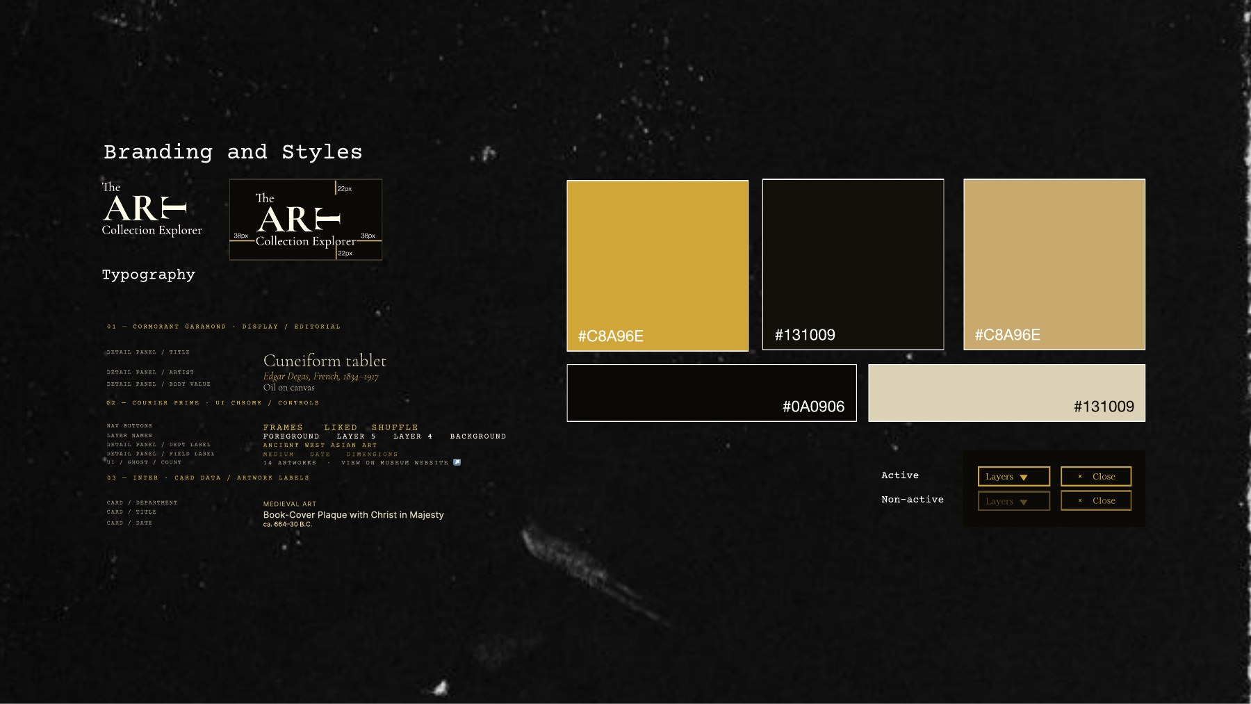
The look comes from museum labels and gallery lighting. My moodboard pulls dark exhibition posters, amber lit rooms and gold detail, which led to a near black background (#131009 and #0A0906) with a gold accent (#C8A96E). Type pairs Cormorant Garamond for display and editorial titles, Courier Prime for UI chrome and controls, and Inter for card data and artwork labels.
Outcome
A critic with opinions
Tamagotchi turns a museum collection into something that talks back. The finished app lets you browse artworks from The Met, like and shuffle them, explore them in 3D, and watch Arthur react, from a blunt “Competent. Nothing more.” to rage when you pick the wrong wing.
Solution
- a browsable collection with frames, likes and shuffle
- a 3D turntable with layer depth and rotation controls
Solution
- a critic who follows the cursor and comments as you explore
- reactions that escalate from frustration to anger to rage and reshape the collection